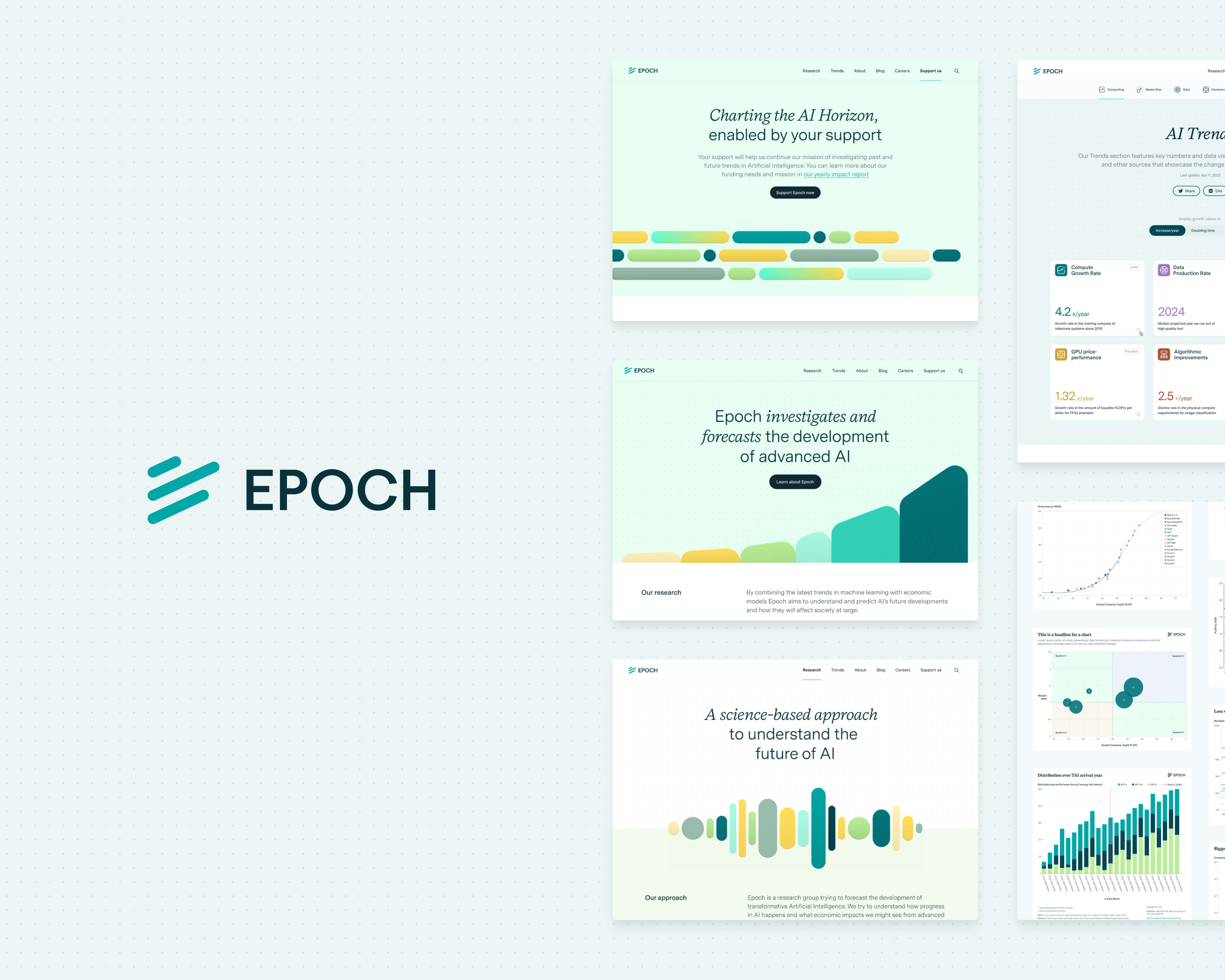
02 – Website redesign
After the successful launch of the new AI Trends page and increased recognition for Epoch's research, we began overhauling the rest of the website. Our main objectives were to align Epoch's growing presence in the AI research community with a more professional image and to more effectively communicate their expanding research findings to a wider audience through better communication tools and an optimized platform.
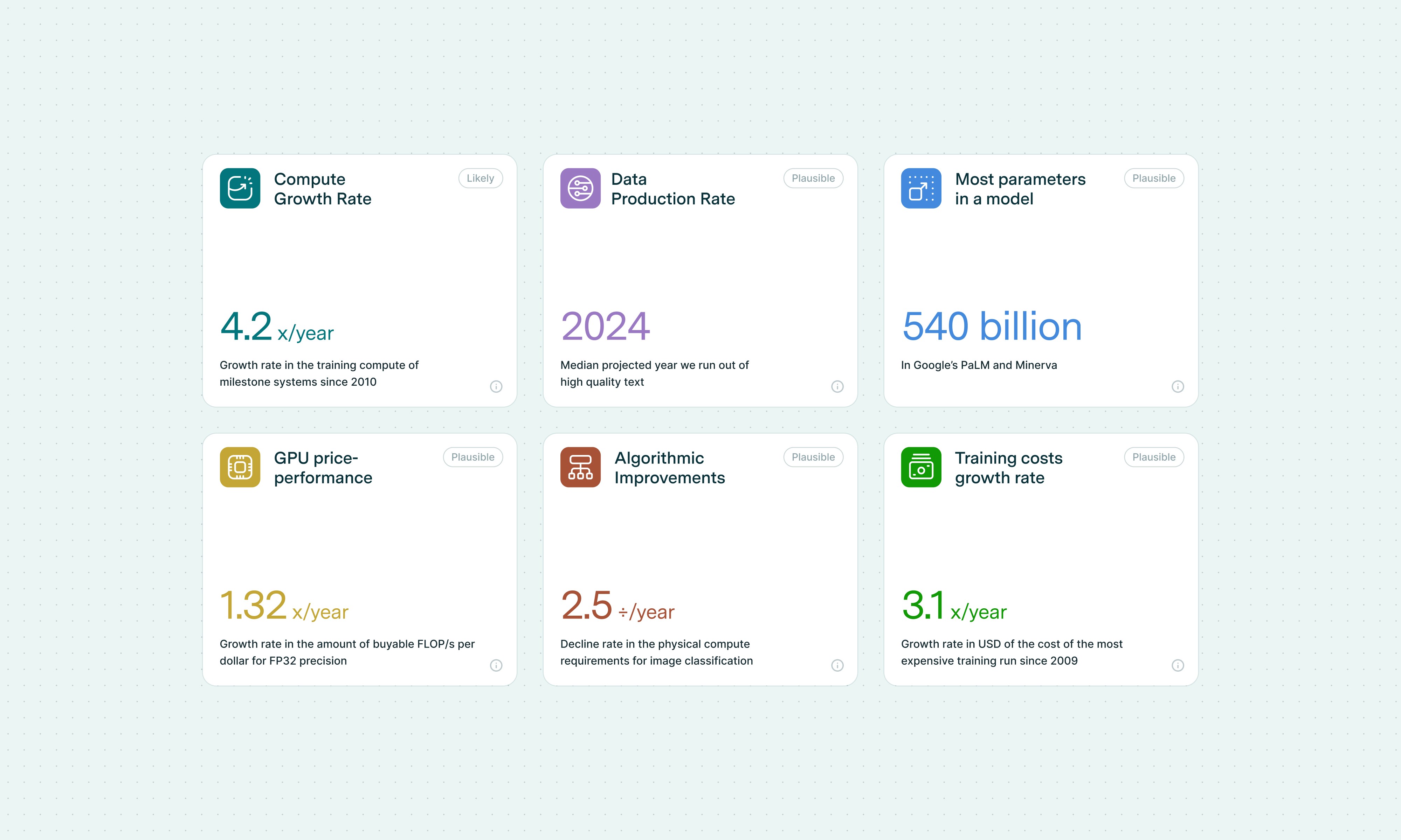
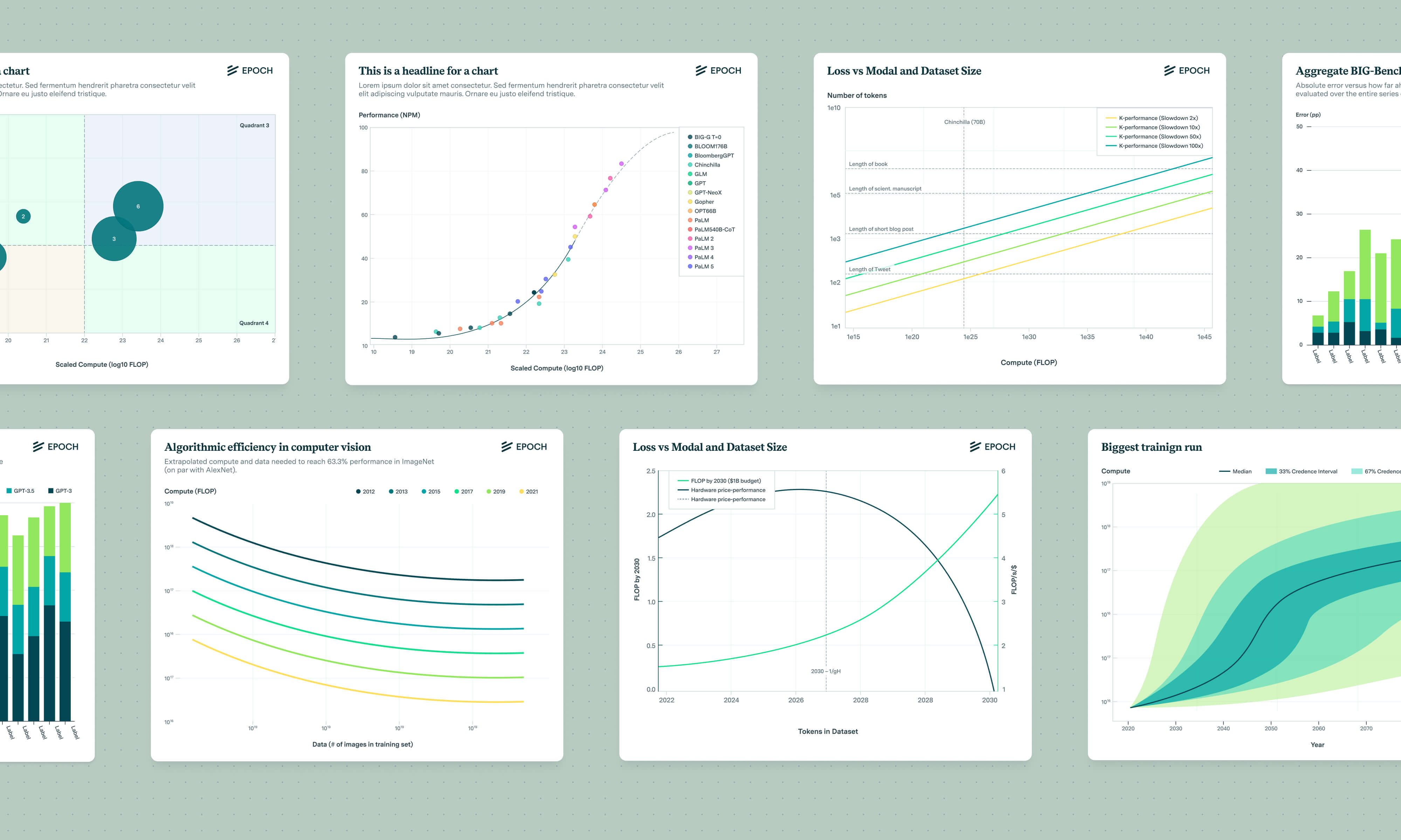
Besides redesigning the main website, this work also included creating a new blog, expanding Epoch's brand design to be visually more flexible, and developing an entire data visualization system that would allow anyone to explore, manipulate, and engage with Epoch's data and research directly – see section 3.
As part of the overall design process, I started to map out the sitemap, required content modules, and integrand them into wireframes to guide the content creation process and visual design. I then explored several visual directions by developing a new brand palette, before settling on a style with an accompanying font pairing.
This identity not only strikes a vibrant yet respectful tone but also pays homage to the aesthetics of research papers, which are deeply rooted in Epoch’s work. At the same time, it embraces a clean look that works well in tight UI situations, enabling Epoch's team to communicate with clarity and scientific substance.
With the team's feedback, I incorporated this style across all pages of the redesigned website and developed a set of simple hero illustrations that enhanced brand recognition and help to guide users through the website's content in a playful and thematic way.
You can explore some of the pages with the applied style below: